Smoke and Mirrors?
Unfortunately, some of the most critical economic statistics published by the US government hide the truth of our economic situation. How do they do this you ask? Let me give you a couple examples, and from these we can draw some initial conclusions.
Unemployment
The government reports the unemployment rate (also known as U-3) and job losses/gains every month just a few days after the month’s end. This initial report is what you see in the headlines, however, what is covered by the mainstream press masks reality. How is it masked? These initial numbers are merely an educated guess, and the press rarely explains how much these numbers change after the headlines. So how do they calculate this number?
One of the factors used to calculate (un)employment numbers is the Birth-Death model. This model estimates the number jobs created by small businesses because the government simply can’t survey every small business owner. In theory, most people would agree that this is a reasonable process, however, its application is another matter. From April to December 2009, the government’s model claimed that small businesses created almost a MILLION jobs! [1] Thus, the unemployment numbers reported to you for the past few months were artificially lowered because the government was creative and imagined (or if you prefer, hoped and changed) jobs into existence. This nonsense continues to this day.
Furthermore, the unemployment numbers are later revised once more complete data arrives [2].

Lately, the initial report has been foolishly hopeful. As of February 2010, official revisions of initial unemployment reports from 2009 have registered an additional 824,000 jobs losses [3]. But have you heard these numbers discussed in the mainstream news?
Another way to make government numbers look rosier is to change how you define terms. For example, a key factor in calculating the unemployment rate is how you define who is unemployed. Please watch the brief video to see an entertaining (though slightly exaggerated) explanation of how the government determines a person’s employment status [4].
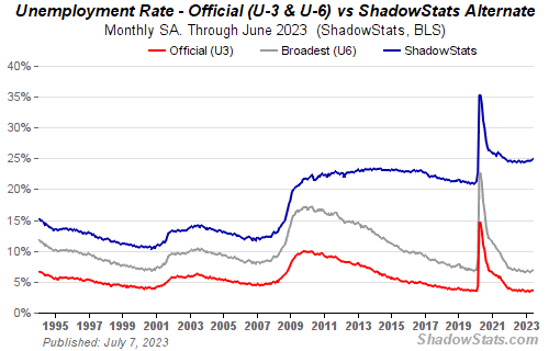
As the video demonstrates, the narrow definition of unemployment underestimates the unemployed and leads to the U-3 unemployment number which distorts reality. When people get so discouraged they quit looking or only work a few hours a week, they are simply no longer counted in the unemployment rate [5]. Fortunately, the government does calculate the U-6 unemployment rate that counts these people, but it is rarely mentioned because it currently stands at 17%.
Unemployment – A Brief Aside
While I am on the topic of unemployment, I want to bring up a few additional numbers. About 70% of US GDP is driven by consumer spending, and so one might wonder how our economy is growing with so many people (aka consumers) being unemployed. A partial answer is unemployment insurance benefits. The government has now extended unemployment benefits up to an additional 72 weeks beyond the standard 27 weeks. Tragically, roughly of 40% of people have been unable to find work in 27 weeks, [6], [7], [8], and while initial unemployment claims have slowed, those individuals on emergency unemployment claims (EUC) have skyrocketed. The latest unemployment insurance numbers can be found here [9].
Finally a fun fact for those of you who help produce a product, you are now outnumbered by government workers [10].
Consumer Price Index
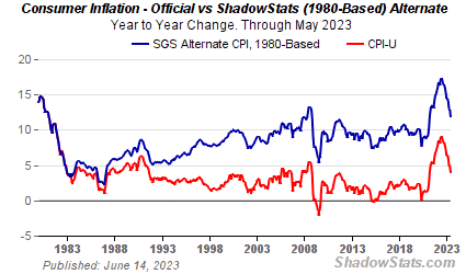
The Consumer Price Index (CPI) is a measure of how the price of goods change over time. For this reason, the government and many corporations use the CPI to determine cost of living adjustments (COLA) for benefits (e.g. Social Security) and/or salaries. What most people don’t know is that government has changed how this number is calculated several times since 1980, and the calculation now grossly understates the rise in prices as shown below. These stealth changes have allowed the government to short change retirees on Social Security payments and have allowed the prices to far outpace the increase in one’s salary.
I hope this brief discussion has shown you that the government is distorting their statistics in an attempt to make you believe our economy is stronger than it is. Additionally, I hope these insights spur you to look beyond the facade so you can begin to construct a more accurate view of the world.
Digging Deeper
To aid you in getting a more realistic view of our economy and our government, I want to encourage you to look at John Williams’ Shadowstats.com. Mr. Williams uses the data published by the government and uses it to reconstruct government statistics based on the original methodology (e.g. CPI, Unemployment, etc). (Note: He explains his reasoning for these changes on his site.) His calculations begin to lift the veil of manipulation from government economic reporting, and it allows you to reconcile government fantasies with what you hear from friends, family and neighbors every day.
Rather than ramble on further, I will simply present a few more charts for Mr. Williams’ site with minimal commentary and will provide a permanent link to his site on the side of this blog.

As a consequence of CPI being understated, GDP growth has been overstated. Once adjusted, it becomes clear the United States has experienced little growth for the past two decades.

Inflation is defined as a growth in the money supply. After the money supply grows, CPI usually increases (i.e. price inflation) about 1-2 years later. Unfortunately, Mr. Williams' adjusted numbers don't even capture the whole picture [11].
Links:
December 2009 Non-Farm Payrolls Report Preview and Forecast - Jesse's Cafe Americain [1]
SnowJob: Revising the Non-Farm Payrolls Report -Jesse's Cafe Americain [2]
824,000 Will Disappear On February 5; BLS Admits Flawed Model But Plans No Changes - Mish's Global Economic Trend Analysis [3]
The Unemployment Game Show (Youtube) - Mint.com [4]
Labor Force Participation Rate Plunges to a 5 Year Low of 64.6% -Zerohedge [5]
Record 40% of Unemployed Without Job for 27+ Weeks - Zerohedge [6]
A Simple, Yet Comprehensive View Of America's Unemployed - Zerohedge [7]
Workers Unemployed So Long, They're Forgetting Their Skills - Clusterstock [8]
Unemployment Insurance Weekly Claims Report - United States Department of Labor [9]
Goods Producing vs Government Jobs - The Mess That Greenspan Made [10]
US Dollar Money Supply Is Underreported - Free Gold Money Report [11]
No comments:
Post a Comment